|
|
RQP #22
Nov 7, 2005 20:39:38 GMT -5
Post by qp on Nov 7, 2005 20:39:38 GMT -5
Well I thought I'd try something new with the RQP this time. Tonight I'll be posting part 1, 2 and 3 of a series of 6 photos in this thread. Showing everyone that something very creative can come from a photo of poor quality.  Photo 1 shows this awesome bird of nature. Guarding our campsite on our trip this last June.  Photo 2 As WW and I paddled closer toward the campsite. I sat still and quiet just waiting for him to leap towards the clouds. Then it happened.  Photo 3 Taking the second shot into my photo shop I zoomed in too allowing all of us a better glimpse of this bird. Coming next will give you ideas as what what can come from one of these shots. qp |
|
|
|
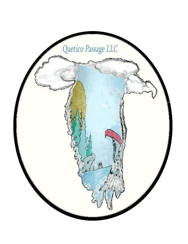
RQP #22
Nov 8, 2005 19:15:24 GMT -5
Post by qp on Nov 8, 2005 19:15:24 GMT -5
So now I moved the zoomed photo into my Adobe InDesign program. Trying to see just how much I can change the photo. I take the eagle and make a few clicks and come up with this.  I really like the clouded effect, so I start thinking of different ideas. Soon it strikes me that one of the drawing WW made would look kind of cool in it. So I add it and came up with this.  Then I decided I like it so much I'll make it into a logo for the qp. I add a couple more clicks and move it to my paint to correct some colors.  I thought it turned out neat. Yeah, it still needs a few things to be complete. But I wanted you to see it and get some feed back on it. Do you like it? Be Honest now. Any pointers from any of you that think it needs something? My biggest thing was the yellow color I just wasn't sure it looked right. Kind of hard to beleive it's the same eagle from the second posted photo? qp |
|